Settings
With Custom Checkout Fields for WooCommerce Pro plugin you can add custom fields to WooCommerce checkout page.
You can choose numerous different types for fields:
- Text
- Textarea
- Number
- Checkbox
- Color
- Datepicker
- Weekpicker
- Timepicker
- Select
- Radio
- Password
- Country
- State
- Phone
- Search
- URL
- Range
Each type comes with specific options you can set for each field.
General Options:
- Label
- Placeholder
- Default value
- Description
- Required
- Customer meta fields
Position Options:
- Section (billing/shipping/account/order)
- Priority (i.e. order)
Input Options:
- Max length
- Min value
- Max value
- Step
- Autofocus
- Autocomplete
Style Options:
- Class
- Label class
- Input class
Visibility Options:
- Product categories
- Product tags
- Products
- User roles
- Min cart amount
- Max cart amount
- Product shipping classes
- Virtual products
- Downloadable products
- Countries
Fee Options:
- Fee value
- Fee type (fixed; percent)
- Fee title
- Is fee taxable
General Options
Plugin settings are located in “WooCommerce > Settings > Custom Checkout Fields”.
- Custom fields number
- Sets number of custom checkout fields you want to add. Click “Save changes” after you set this number – new settings subsections will be added for each field.
- Default:
1
- Default:
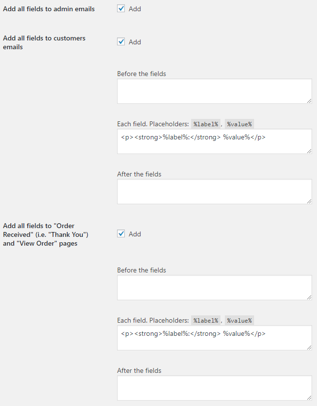
- Add all fields to admin emails
- Adds all custom checkout fields to admin emails.
- Default:
yes
- Default:
- Add all fields to customers emails
- Add all custom checkout fields to customers emails.
- Default:
yes
- Default:
- Emails: Before the fields
- Added before the fields in emails.
- Default: None
- Emails: Each field
- Placeholders:
%label%,%value%.- Default:
<p><strong>%label%:</strong> %value%</p>
- Default:
- Emails: After the fields
- Added after the fields in emails.
- Default: None
- Add all fields to "Order Received" (i.e. "Thank You") and "View Order" pages
- Default:
yes
- Default:
- Pages: Before the fields
- Added before the fields on “Order Received” (i.e. “Thank You”) and “View Order” pages.
- Default: None
- Pages: Each field
- Placeholders:
%label%,%value%.- Default:
<p><strong>%label%:</strong> %value%</p>
- Default:
- Pages: After the fields
- Added after the fields on “Order Received” (i.e. “Thank You”) and “View Order” pages.
- Default: None
- Advanced: Force fields sort by priority
- Enable this if you are having theme related issues with “Priority (i.e. order)” options.
- Default:
no
- Default:
Field Options
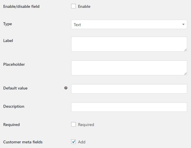
- Enable/Disable
- Enables/disables the current field.
- Default:
no
- Default:
- Type
- Field type. Possible values: Text; Textarea; Number; Checkbox; Datepicker; Weekpicker; Timepicker; Select; Radio; Password; Country; State; Email; Phone; Color; Search; URL; Range.
- Default:
Text
- Default:
- Label
- Field label.
- Default: None
- Placeholder
- Field placeholder.
- Default: None
- Default value
- Enter default field value here. Use
1or0for the checkbox type.- Default: None
- Description
- Field description.
- Default: None
- Required
- Is field required or optional.
- Default:
no
- Default:
- Customer meta fields
- Adds the field to the customer meta fields.
- Default:
yes
- Default:
Field Options: Position

- Section
- Possible values: Billing; Shipping; Account; Order notes.
- Default:
Billing
- Default:
- Priority (i.e. order)
- If set to zero – field will be added to the end of the section.
- Default:
0
- Default:
Field Options: Input
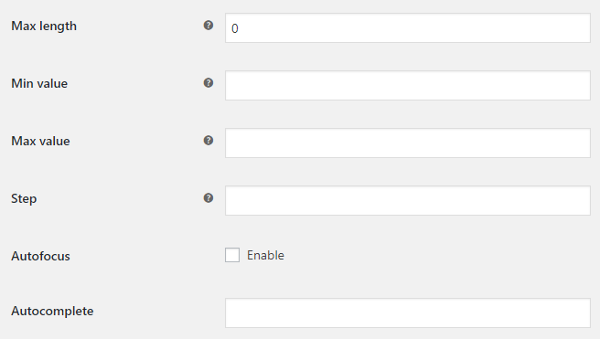
- Max length
- Maximum number of character for an input field. E.g. for Text type.
- Default:
0
- Default:
- Min value
- Minimum value for an input field. E.g. for Number/Range type. Leave blank to disable.
- Default: None
- Max value
- Maximum value for an input field. E.g. for Number/Range type. Leave blank to disable.
- Default: None
- Step
- Legal number intervals for an input field. E.g. for Number/Range type. Leave blank to disable.
- Default: None
- Autofocus
- Default:
no
- Default:
- Autocomplete
- Default: None
Field Options: Style

- Class
- Possible values: Wide; First; Last.
- Default:
Wide
- Default:
- Label class
- Default: None
- Input class
- Default: None
Field Options: Visibility
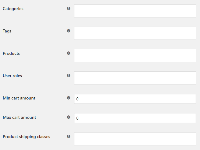
- Categories
- Show this field only if there is a product of selected category in cart. Leave blank to show for all products.
- Default: None
- Tags
- Show this field only if there is a product of selected tag in cart. Leave blank to show for all products.
- Default: None
- Products
- Show this field only if there is a selected product in cart. Leave blank to show for all products.
- Default: None
- User roles
- Show this field only if visitor has selected user role. Leave blank to show for all users.
- Default: None
- Min cart amount
- Show this field only if cart total is at least this amount. Ignored if set to zero.
- Default:
0
- Default:
- Max cart amount
- Show this field only if cart total is not more than this amount. Ignored if set to zero.
- Default:
0
- Default:
- Product shipping classes
- Show this field only if there is a product with selected shipping classes in cart. Leave blank to show for all products.
- Default: None
- Virtual products
- Possible values: Always show the field; Show the field only if there are at least one virtual product in the cart; Hide the field if there are at least one virtual product in the cart.
- Default:
Always show the field
- Default:
- Downloadable products
- Possible values: Always show the field; Show the field only if there are at least one downloadable product in the cart; Hide the field if there are at least one downloadable product in the cart.
- Default:
Always show the field
- Default:
- Countries
- Countries to show/hide the field for.
- Default: None
- Countries: Action
- Possible values: Hide in selected countries; Show in selected countries only.
- Default:
Hide in selected countries
- Default:
Field Options: Fee Options
In this optional section you can set fees that are added to the cart totals in case if custom field’s value is not empty.
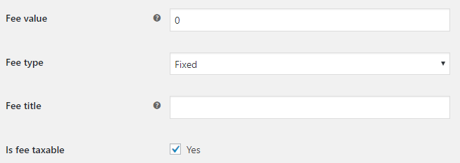
- Fee value
- Sets fee value. Can be positive or negative. Ignored if set to zero.
- Default:
0
- Default:
- Fee type
- Sets fee type. Possible values: Fixed; Percent.
- Default:
Fixed
- Default:
- Percent fee: Cart total
- Used only if “Percent” is selected in “Fee type”. Possible values: Subtotal before discounts; Subtotal after discounts.
- Default:
Subtotal after discounts
- Default:
- Percent fee: Add shipping
- Adds shipping cost to cart total. Used only if “Percent” is selected in “Fee type”.
- Default:
no
- Default:
- Fee title
- Sets fee title. Can be empty.
- Default: None
- Is fee taxable
- Sets if fee is taxable or not.
- Default:
yes
- Default:
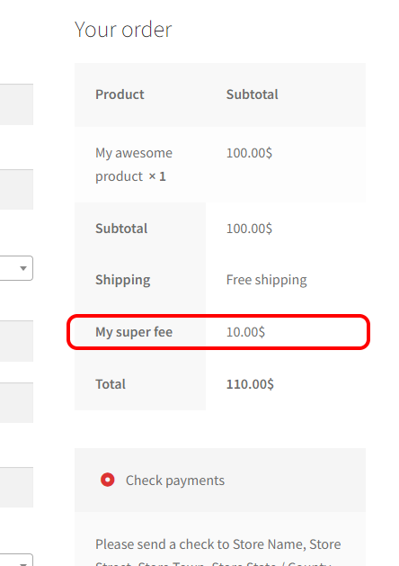
Field Options: Select/Radio Type Options
Fill this section only if select/radio type is selected.
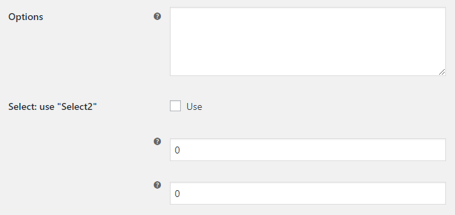
- Options
- One option per line
- Default: None
- Select: use "Select2"
- Default:
no
- Default:
- Select2: Min input
- Select2: Number of characters necessary to start a search. Ignored if set to zero.
- Default:
0
- Default:
- Select2: Max input
- Select2: Maximum number of characters that can be entered for an input. Ignored if set to zero.
- Default:
0
- Default:
Field Options: Checkbox Type Options
Fill this section only if checkbox type is selected.

- Value for ON
- Default:
Yes
- Default:
- Value for OFF
- Default:
No
- Default:
Field Options: Datepicker/Weekpicker Type Options
Fill this section only if datepicker/weekpicker type is selected.
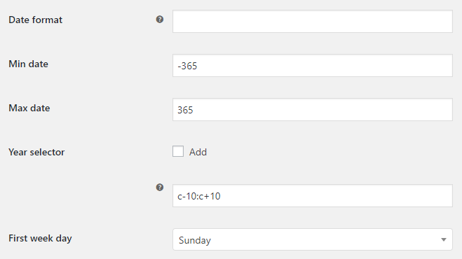
- Date format
- Leave blank to use your current WordPress format. Visit documentation on date and time formatting for valid date formats.
- Default: None
- Min date
- In days.
- Default:
-365
- Default:
- Max date
- In days.
- Default:
365
- Default:
- Year selector
- Default:
no
- Default:
- Year selector: year range
- The range of years displayed in the year drop-down: either relative to today’s year (“-nn:+nn”), relative to the currently selected year (“c-nn:c+nn”), absolute (“nnnn:nnnn”), or combinations of these formats (“nnnn:-nn”). Note that this option only affects what appears in the drop-down, to restrict which dates may be selected use the minDate and/or maxDate options.
- Default:
c-10:c+10
- Default:
- First week day
- Possible values: Sunday; Monday; Tuesday; Wednesday; Thursday; Friday; Saturday.
- Default:
Sunday
- Default:
Field Options: Timepicker Type Options
Fill this section only if timepicker type is selected.

- Time format
- Visit timepicker options page for valid time formats.
- Default:
hh:mm p
- Default:
- Interval
- In minutes.
- Default:
15
- Default: