
Introduction
Having a responsive wishlist page is essential for providing a seamless shopping experience across all devices. Woo-Commerce allows you to customize the responsiveness of your wishlist page, ensuring that it adapts perfectly to different screen sizes. This article will guide you through the process of setting up responsiveness for your Woo-Commerce wishlist page.
- Step-by-Step Customization Guide:
- Accessing the Wishlist Responsiveness Settings:
1. Log into your WordPress Dashboard:
- Navigate to the left sidebar and click on ‘Woo-Commerce‘.
- Proceed to ‘Settings’.
2. Locate the Wishlist Settings:
- Click on the ‘Wishlist‘ tab at the top right of the settings page to access the wishlist-specific settings.
Customizing Responsiveness:
1. Responsive Layout Settings:
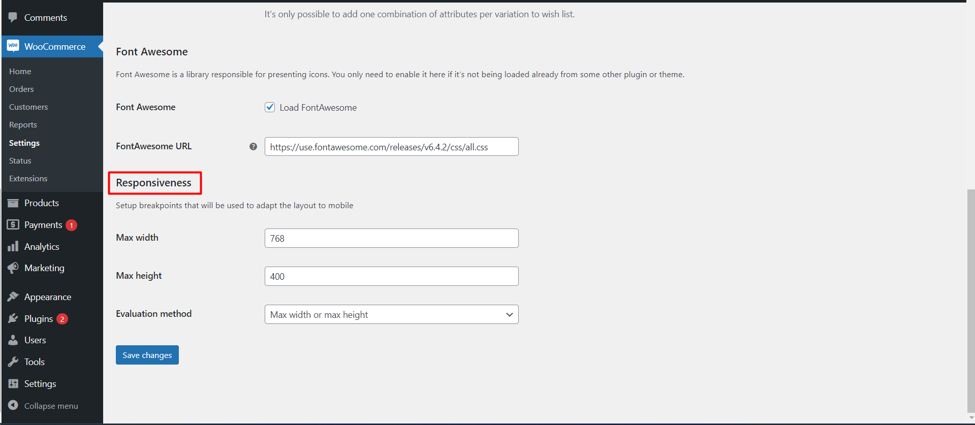
- Scroll to the ‘Font Awesome’ section where you will find a subsection titled ‘Responsiveness’.
- This area is dedicated to setting up breakpoints for your wishlist layout on mobile devices.
2. Set Maximum Width and Height:
- Enter the maximum width and height in pixels for your wishlist elements.
- These values determine the maximum size at which your wishlist will be displayed before adapting to smaller screens.
3. Choose Evaluation Method:
- Select an evaluation method from the dropdown menu – ‘Max width or max height’.
- This setting decides how the responsiveness should kick in based on either the width or the height of the screen.
4. Save Your Changes:
- After you’ve input your desired settings, make sure to click ‘Save changes’ to apply them.
Why Responsiveness is Crucial
- User Experience: A responsive wishlist ensures a better user experience, especially on mobile devices where screen real estate is limited.
- Increased Engagement: Responsive design can lead to increased user engagement and potentially higher conversion rates as users can manage their wishlists on the go.
- SEO Benefits: Responsiveness is a factor in search engine rankings, with mobile-friendly sites often receiving a boost in search results.
Tips for a Mobile-Friendly Wishlist
- Test Across Devices: After customizing the settings, test the wishlist page on various devices to ensure the layout looks good and is user-friendly.
- Consistent Design: Your wishlist should maintain the look and feel of your overall website design, even on mobile devices.
- Easy Navigation: Make sure that any buttons or links on the wishlist page are easily clickable on touchscreens.