Customize Add to Cart Button Color in WooCommerce
Where every click and every conversion matters, the color of your add to cart button can make or break your sales. It may seem like a tiny and insignificant detail, but the psychological impact of color shouldn’t be underestimated.
In this article, we will explore the importance of add to cart button color, the psychology behind colors in e-commerce, and how to choose the right color for your WooCommerce store.
Understanding the Importance of Add to Cart Button Color

When it comes to online shopping, the visual elements of your website play a crucial role in capturing the attention of potential customers.
The add to cart button, in particular, is the gateway to converting visitors into buyers.
While these details are important, the color choice is also something that should be carefully considered.
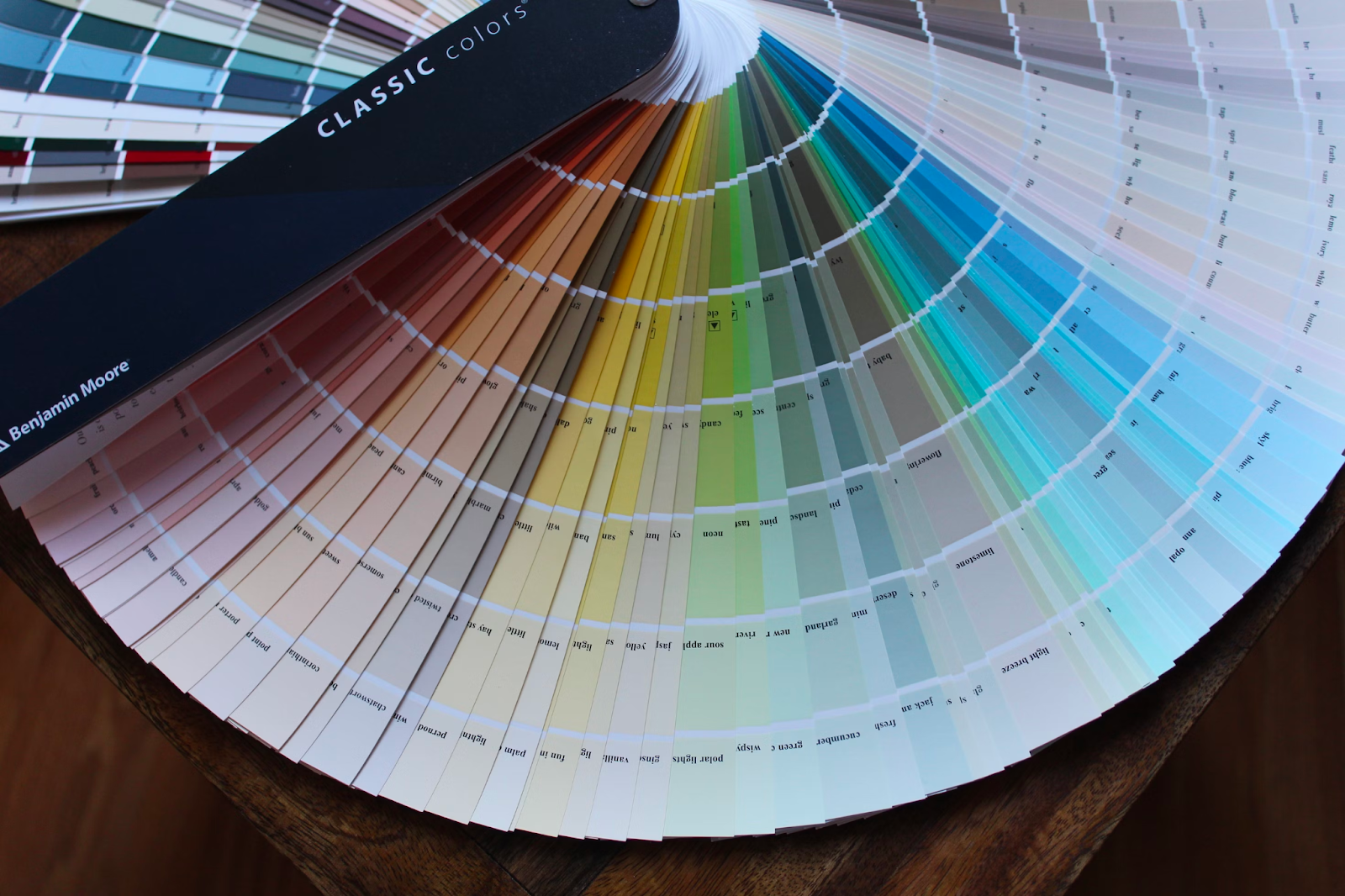
The Role of Color in Online Shopping
Color has the power to convey meaning, trigger emotions, and create a sense of trust and credibility.
In the context of e-commerce, the colors chosen for a button or a store can create a sense of urgency, establish a brand identity, and guide customers towards making a purchase.
When it comes to online shopping, the visual elements of your website play a crucial role in capturing the attention of potential customers.
Did you know that studies show ads in color gain 42% more attention than those in black and white?
Customers may not be conscious about the decisions they are making and the way colors are playing a part in those, but the impact is proven in many studies.
Imagine a scenario where you are browsing an online store for a new pair of shoes. As you scroll through the different options, your attention is immediately drawn to a vibrant red “Add to Cart” button.
The color red, being associated with urgency and excitement, triggers a sense of desire within you. Without even realizing it, you are already one step closer to making a purchase.
On the other hand, if the add to cart button were a calming shade of blue or green, you might feel a sense of trust and reliability. These cool colors create a soothing effect, making you feel more comfortable and confident in your decision to buy.
The Psychology of Specific Colors in eCommerce
Before diving into the process of choosing the perfect add to cart button color, it’s important to understand the emotional responses triggered by different colors.
By aligning your color choice with your target audience’s emotional needs, you can create a more engaging and persuasive shopping experience.

Colors have the power to evoke a wide range of emotions. Here are some common emotional responses associated with different colors:
- Red: Passion, urgency, excitement
- Orange: Energy, enthusiasm, creativity
- Yellow: Happiness, optimism, warmth
- Green: Growth, harmony, freshness
- Blue: Trust, calmness, reliability
- Purple: Royalty, luxury, creativity
Sometimes, picking an important button (like “add to cart”) color to be the same color of your brand might not help, while it looks good (for the marketing team), it might be invisible for users since it looks like many other elements in the page.
How Color Affects Buying Decisions
Humans are complicated and our brains often react to things without us being conscious of it.
Red, as mentioned earlier, is known to create a sense of urgency and excitement. This is why it is often used in clearance sales or limited-time offers. Studies have shown that the color red stimulates the adrenal glands, increasing heart rate and creating a sense of urgency.
By incorporating red into your add to cart button, you can create a sense of urgency and encourage customers to make a quick purchase. Now you know why you see so many red “sale” signs.
Another example, Green, is often associated with nature and health. It is a color that represents growth, harmony, and balance. By incorporating green into your add to cart button, you can create a sense of well-being and reassurance. This is particularly effective for products that are eco-friendly or promote a healthy lifestyle.
Understanding the psychology of colors and their impact on buying decisions is just the first step. It is important to conduct A/B testing to determine which color resonates best with your target audience.
By analyzing data and customer feedback, you can fine-tune your add to cart button color to maximize conversions and drive sales.
Color Preferences by Gender and Age
When it comes to color preferences, it’s important to consider the demographic you are targeting. Research has shown that gender and age can influence color perceptions.
For example, studies have found that women tend to prefer softer and more vibrant colors, while men are more inclined towards bold and darker shades. This difference in color preferences can be attributed to various factors, including societal norms and biological differences. The important thing is to establish what might work for your store.
Younger audiences are often more receptive to bright and bold colors, while older audiences may prefer more subdued tones. This can be attributed to generational differences, personal experiences, and culture, and is often not a conscious choice.
Understanding the color preferences of your audience can help you create a more personalized and appealing shopping experience. By tailoring your color choices to match the preferences of your target demographic, you can increase engagement, build trust, and ultimately drive more conversions.
Choosing the Right Color for Your Add to Cart Button
Now that you understand a bit more about the psychology behind colors in e-commerce, it’s time to choose the perfect color for your WooCommerce button. When making this decision, there are many factors to consider.
Factors to Consider When Choosing a Color
When selecting the color for your add to cart button, keep the following factors in mind:
- Brand Identity: Your add to cart button color should align with your overall identity and convey the right message about your business, such as using green to show that you are environmentally friendly.
- Contrast: The color of your add to cart button can stand out from the background and other elements on your website to grab attention.
- Psychological Impact: Consider the emotional responses associated with different colors and choose a color that aligns with your target audience’s needs, and your own goals.
- Accessibility: Ensure that the color you choose meets accessibility standards and is visible to all users, including those with visual impairments.
When it comes to brand identity, it’s important to choose a color that represents your business and resonates with your customers.
For example, if you have a luxury brand, you may want to consider using a sophisticated color like gold or silver for your add to cart button.
On the other hand, if you have a playful and vibrant brand, you might opt for a bright and energetic color like hot pink or neon green.
How to Change Add to Cart Button Color
Once you have chosen the perfect color for your add to cart button, implementing it in your WooCommerce store is a relatively simple process.
If you’re a developer, then we’ve got you covered with our code snippet to change Add to Cart color, but if you prefer easier options, here you go.
Many themes offer this as part of their settings, to verify if your theme supports that, hover over the “Appearance” section on your WordPress dashboard, and click “Customize”, select “WooCommerce”, then check in either single products section, or if there is a “Colors” section, you might want to check there.
If you prefer to do it with a plugin, then there are many of them to do this job for you.
How to Customize Add to Cart Button Labels & Text
The top plugin for WooCommerce users to control and alter their buttons is Add to Cart Button Labels.
Even small increases in conversions may make a big financial difference, that’s why you can utilize our plugin to customize add to cart button labels for WooCommerce, give live pricing, and even show different languages in different regions.
So instead of showing “Add to cart”, the plugin allows you to show any text you want, like “Get this now”, or “Buy for $10” or anything you can think of.

The Add to Cart Button Labels plugin gives you the convenience to modify the “Add to Cart” button labels in a way that harmonizes perfectly with brand messaging, giving you control over each and every button on your site to help increase conversion rates, managing each button individually and providing a user-friendly experience for every visitor.
Measuring the Impact of Button Color on Conversions

To accurately measure the impact of your add to cart button color on conversions, you need to track and analyze conversion rate data.
Tools for Tracking Conversion Rates
There are various tools available that can help you track conversion rates, such as Google Analytics, Kissmetrics, and Crazy Egg. These tools provide valuable insights into user behavior and can help you identify any areas for improvement.
Tools like Reports for WooCommerce allow you to check things like conversions and traffic, helping to establish what is working and what isn’t, and make more informed decisions on color, and much more.
Interpreting Conversion Rate Data

When analyzing conversion rate data, look for patterns and trends. Keep in mind that the effectiveness of your button color may vary depending on factors such as your target audience, product offering, and industry. Use the data to make informed decisions and continuously tweak and optimize your add to cart button color for maximum conversions.
Final Words
By following these steps, you’ll be well on your way to making effective use of colors and embracing the psychology of those colors to influence your customer decisions. Making these changes can boost your bottom line and help to optimize your WooCommerce store.


