
One-Page vs Multi-Page Checkout for WooCommerce: Conversion Data & How to Choose
The checkout page is the last step between a potential customer and a sale. And yet, it’s where many buyers drop off.
That’s why the question “One Page Checkout vs Multi Page Checkout” has become a hot topic for WooCommerce store owners trying to reduce cart abandonment and increase conversion rates.
➡ In this article:
We’ll walk through the pros and cons of each checkout style, how they affect your store’s performance, and which might be the better fit depending on your products, customers, and goals.
Let’s break it down step by step.
Why Checkout Flow Matters More Than You Think?
Imagine walking into a store, picking up what you need, and then standing in a long, winding line to check out.
The longer the line, the more likely you are to put things back and leave.
Online shopping works the same way.
A complicated or slow checkout process frustrates shoppers, it creates friction, that friction often results in abandoned carts and lost revenue.
Studies consistently show that the fewer steps it takes to finish a purchase, the more likely customers are to complete it.
That’s why store owners start asking: should I keep my checkout all on one page, or spread it out into steps?
That’s where One Page Checkout vs Multi Page Checkout comes into play.
What is One Page Checkout?
A one-page checkout experience shows all the necessary checkout fields, billing, shipping, payment, and order review, on a single page.
The goal is simple:
Show everything at once, so the customer doesn’t have to click “Next” or wait for more screens to load.
Common benefits:
- Faster checkout speed
- Fewer clicks and reloads
- Easier to scan and fill out, especially for returning customers
- Great for mobile users who want to complete purchases quickly
But it’s not always perfect:
If your form is too long or cluttered, it can overwhelm shoppers, people may not want to scroll endlessly on mobile devices.
And if you require complex information (like gift messages, delivery instructions, or tax IDs), it can feel messy.
This is where tools like WooCommerce Additional Checkout Fields Customizer can help, you can control which fields show, hide the ones that aren’t needed, and re-order them to fit your checkout logic, all without touching code.
What is Multi Page Checkout?
Multi-page checkout breaks the process into separate steps.
Each part of the process, billing info, shipping, payment, and confirmation, is handled one screen at a time.
Common benefits:
- Cleaner layout with fewer fields per screen
- Customers feel guided through a clear process
- Easier to track where customers drop off in the funnel
- Less overwhelming for first-time buyers
But there are downsides:
The extra steps increase the chance of drop-offs. Each time a page loads, customers might get distracted or frustrated.
It’s also a slower experience for returning users or mobile shoppers who already know what they want.
Some WooCommerce themes use this format by default, but it’s not always necessary.
Comparing the Two: Speed, UX, and Cart Abandonment
Let’s talk about what really matters: results.
Many store owners want a straight answer.
Which one actually helps more people complete their orders?
-
Conversion Rate
In general, one-page checkouts tend to show better performance in checkout conversion rate.
Fewer clicks, faster load times, and less room for distractions mean customers can act quickly.
But it depends on your audience and what you sell, stores with lots of custom fields or high-ticket items might benefit from a slower, more guided multi-step approach.
-
Checkout Speed
Speed is one of the biggest reasons people abandon their cart.
With multi-step checkout, loading a new page for every step adds seconds, and seconds count.
One-page checkouts load once and let users complete everything in one go.
-
Mobile Experience
Mobile shoppers are less patient, they prefer fewer taps and quicker flows.
A one-page checkout often wins here, as long as the form is well designed and not too cluttered.
-
User Experience
This one is tricky!
Some people feel more comfortable filling out information in small chunks, which makes multi-step checkouts feel smoother.
Others just want to get it done fast, and don’t like clicking “Next” over and over.
The best way to know what works for your audience is to test both.
WooCommerce and Checkout Customization Options
Out of the box, WooCommerce gives you a fairly standard checkout page. But it doesn’t lock you in. You can choose how to format the layout, what fields appear, and how many steps your checkout includes.
And that’s where plugins come in.
One of the most flexible options is the WooCommerce Additional Checkout Fields Customizer from WPFactory.
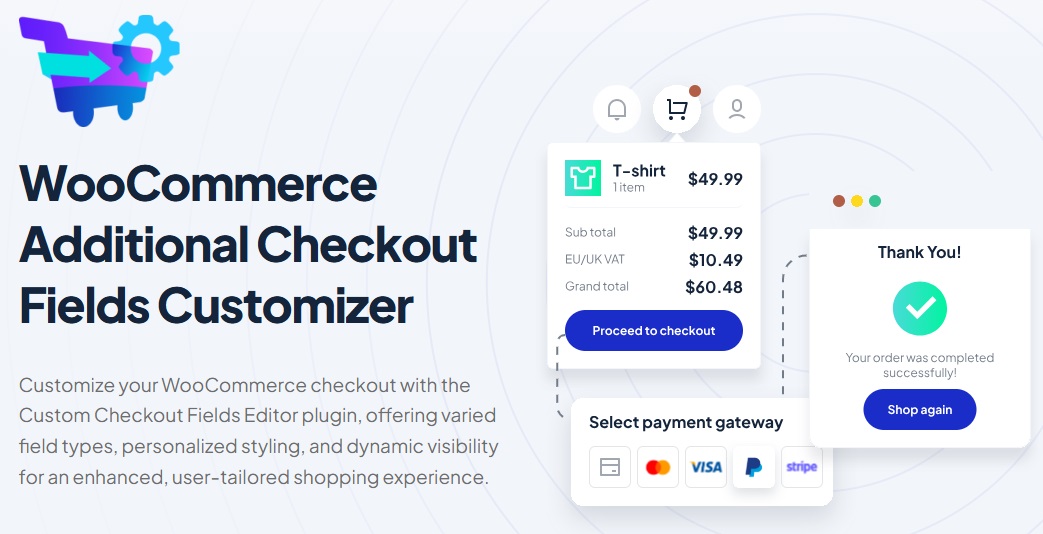
It lets you:
- Add or remove checkout fields
- Make certain fields conditional (based on product, cart total, user role, etc.)
- Rearrange the order of fields
- Mark fields as required or optional
- Customize labels for better clarity
This plugin works well for both checkout styles.
If you’re using one-page checkout and want to avoid overwhelming the customer, you can hide unnecessary fields.
If you’re sticking with a multi-page setup, you can streamline each step.
➡ Another tip:
Use guest checkout unless you really need people to register, forcing account creation is one of the top causes of cart abandonment.
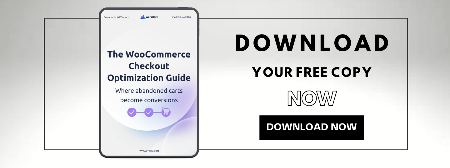
If you’re exploring ways to improve your checkout flow even further, you can grab our free copy of The Ultimate WooCommerce Checkout Optimization Guide, It’s packed with real examples and tips from successful store owners.
When to Choose One Page vs Multi Page?
There’s no universal answer, yes, it depends on your store, your products, and your customers.
Here’s a simple guide:
One Page Checkout Works Well For:
- Digital products like eBooks, templates, or software
- Subscription signups
- Low-cost or impulse purchases
- Returning customers or members
- Mobile-first shoppers
Multi Page Checkout Might Be Better If:
- You sell complex items with many customization options
- You need to gather a lot of details (like installation notes, license IDs, or documents)
- You offer several shipping methods or international tax settings
- You want to track where drop-offs occur in the checkout funnel
➡ For example:
A store selling downloadable music tracks would probably do well with one-page checkout.
But a custom furniture seller might benefit from the step-by-step guidance of multi-page checkout.
Comparison Table: One Page vs Multi Page Checkout
| Feature | One Page Checkout | Multi Page Checkout |
|---|---|---|
| Speed | Faster, all fields on one page | Slower, each step loads separately |
| User Experience (UX) | Great for repeat customers and quick buys | Better for guiding new or detailed orders |
| Mobile Friendliness | Usually more efficient | Can be harder to navigate |
| Abandonment Risk | Lower (if designed well) | Higher due to extra steps |
| Field Management | Needs minimal clutter | More room to spread out fields |
| Ideal For | Digital goods, low-cost items | Complex orders, high-ticket products |
| Customization Flexibility | High (with plugins like WPFactory’s) | Also flexible, especially for structured flows |
Final Thoughts
So, which one wins, One Page Checkout vs Multi Page Checkout?
There’s no single winner, each format has strengths and weaknesses.
What matters most is how well your checkout experience fits your products and your customers’ expectations.
Here’s a quick recap:
- One-page checkout is faster and better for simple products
- Multi-page checkout gives more control and works well for complex orders
- Keep the layout clean, with as few required fields as possible
- Test both formats if you’re unsure
- Use tools like WPFactory’s checkout field customizer to adapt without code
- Don’t forget mobile experience, it’s often where things break
If you want more people to finish their orders, focus on the checkout UX, reduce friction, and give customers the smoothest path possible from cart to confirmation.
The good news is, WooCommerce gives you the freedom to choose.
And with the right tools, you don’t have to guess what works, you can build it your way.


This checkout comparison is incredibly insightful! Your cart abandonment statistics showing 21% lower drop-offs on one-page layouts are convincing. That step-by-step breakdown of friction points in multi-page systems highlights exact pain points. The mobile optimization advantages for single-page checkouts are particularly compelling. Your security analysis proving both options can be equally secure resolves a major merchant concern!
This article provides a comprehensive and practical comparison between one-page and multi-page checkout flows, offering valuable insights for WooCommerce store owners to optimize their conversion rates based on their specific products and customer needs.